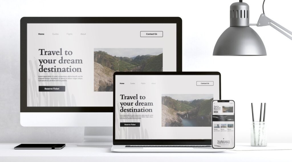
Responsive Web Design Services UK for Every Screen
WebSole provides responsive web design for UK businesses, creating websites that adapt to desktops, laptops, tablets and smartphones while keeping the content, navigation and user experience clear and easy to use.
We combine responsive layouts, mobile-first thinking, accessible design, performance considerations and conversion-focused user experience to create websites that work across different screen sizes and devices.

What Is Responsive Web Design?
Responsive web design is an approach to website design and development where the layout and content adapt to the visitor’s screen size and device.
Instead of creating completely separate websites for desktop and mobile, a responsive website uses flexible layouts and components that adjust to different screen dimensions.
This can help create a consistent experience across:
- Desktop computers
- Laptops
- Tablets
- Smartphones
- Different screen resolutions
- Different orientations
The objective is simple:
Your website should remain useful and easy to navigate regardless of the device being used.
Why Responsive Web Design Matters
People can discover your business from many different devices.
Someone might first find your website on their phone, return later using a laptop and eventually contact you from a tablet.
If the website does not adapt properly, important information can become difficult to access.
A responsive website can make it easier for visitors to:
- Read your content
- Navigate your website
- View images
- Complete forms
- Click buttons
- Browse products
- Request a quote
- Contact your business
- Complete ecommerce actions
Responsive design is therefore not simply about making a website “fit” on a smaller screen.
It is about creating a usable experience across devices.
Responsive Web Design Important for all Type of Businesses
Mobile-Friendly Website Design for UK Businesses
A mobile-friendly website should make the important information easy to access without unnecessary effort.
We consider:
- Navigation
- Typography
- Spacing
- Buttons
- Forms
- Images
- Content hierarchy
- Page layouts
- Menus
- Calls to action
- Ecommerce interactions
A visitor should not have to pinch, zoom or struggle with an oversized desktop layout.
Mobile-First Web Design
For many projects, we consider the mobile experience early in the design process rather than treating mobile as a final adjustment.
This can involve starting with the most important content and interactions before expanding the layout for larger screens.
The process can help identify:
- What information matters most
- Which navigation elements are essential
- How forms should work
- Where CTAs should appear
- How images should behave
- How content should be prioritised
The final website can then expand naturally across larger screens.
Responsive Website Design for Different Devices
A responsive website may need to adapt to very different screen sizes.
Smartphones
Important considerations include:
- Compact navigation
- Readable text
- Touch-friendly buttons
- Shorter interaction paths
- Optimised images
- Mobile forms
- Visible CTAs
Tablets
Tablet layouts often sit between mobile and desktop.
Navigation, columns, cards and images may need different spacing and proportions.
Laptops and Desktops
Larger screens provide more space, but that does not mean every page should simply become wider.
Good desktop design still requires:
- Comfortable reading widths
- Clear hierarchy
- Balanced spacing
- Logical navigation
- Appropriate content density
Responsive Web Design and User Experience
Responsive design is closely connected to user experience.
A website may technically resize correctly while still being difficult to use.
For example:
- A menu may be difficult to open
- Buttons may be too small
- Forms may require excessive scrolling
- Text may become difficult to read
- Important information may be pushed too far down the page
- Product filters may be awkward on mobile
We therefore consider how people actually interact with the website rather than only whether the layout technically changes size.
Responsive Web Design and SEO
Mobile usability and technical website quality are important parts of a modern search strategy.
Google’s page-experience documentation encourages websites to provide a good overall user experience, including mobile usability, secure pages and strong Core Web Vitals, while noting that there is no single “page experience” signal that guarantees rankings. (developers.google.com)
Responsive design can support SEO by providing a consistent website experience and avoiding unnecessary separate mobile versions.
SEO considerations can include:
- Responsive layouts
- Mobile usability
- Page performance
- Content accessibility
- Internal linking
- Metadata
- Heading structure
- Image optimisation
- Crawlability
- Structured data
For broader optimisation, see our [SEO Services] /seo-services/ page.
Responsive Design and Website Performance
Responsive design and website performance should be considered together.
Large images, unnecessary scripts, excessive animations and poorly implemented components can affect how quickly a page loads.
We can consider:
- Image dimensions
- Image compression
- Responsive images
- Font loading
- CSS
- JavaScript
- Third-party scripts
- Animation
- Page resources
- Mobile performance
The goal is not simply to remove everything from a website.
It is to find an appropriate balance between functionality, visual quality and performance.
Responsive Ecommerce Web Design
Ecommerce websites have additional mobile considerations.
Customers may need to:
- Browse categories
- Search products
- Use filters
- View product images
- Select variations
- Add products to their basket
- Review their cart
- Enter information
- Complete checkout
A responsive ecommerce website should make these actions straightforward on smaller screens.
For ecommerce projects, see our [Ecommerce Web Design] /ecommerce-web-design/ service.